Project Type
Personal
Date
Oct-Nov 2019
My Role
Research, user testing & stories, wireframing, visual design, prototyping
Overview
HBO Go is a video streaming service. It offers subscribers access to video content over multiple devices. Library of content includes original series, movies, and documentaries by HBO and HBO Asia, as well as externally-produced Hollywood, Asian, and kid-friendly content.
Goal
Provide users with a seamless browsing and watching experience that allows them to enjoy the high-quality content without obstacles.
Problem Statement
Browsing and watching HBO Go’s content is hindered by a poor search system, unintuitive information architecture, and a lack of basic expected features.
This causes problems for new and existing subscribers because they have to spend unnecessary time and effort to overcome these obstacles in order to access and enjoy the content.
This problem is important because it could result in frustrated users unsubscribing and choosing to go with another streaming competitor instead. Not only will they not recommend HBO Go to others, they might even discourage them from subscribing.
Scopes & Constraints
This project focuses on the HBO Go website and not the HBO Go mobile app
As this was a personal project, I didn’t have an actual client to speak to and definitively learn about their business goals. Instead, I derived their goals from my own online research/observation.
While I was able to find statistics on video streaming services, the bulk of them referenced an American audience
Process
Desk Research
To understand HBO’s business strategy and the on-demand streaming market, I looked online to gather insights from existing information and research.
HBO Go Business Strategy
Quality over Quantity
Unlike competitors like Netflix, HBO chooses to focus on quality over quantity. This allows them to uphold their iconic branding and reputation as the industry’s gold standard in quality programming, which in turn attracts well-known industry names and viewers.
Source: Business Insider, Wall Street Journal
On-demand streaming market
Increase in cord-cutting and video streaming users
There is a global increase in cord-cutting (cancelling cable/pay-TV subscriptions) and video streaming subscriptions, leading to growing market competition and user expectations.
Source: Statistica, The Wall Street Journal, The Straits Times
How important is user experience to streaming subscribers?
Key findings from a 2019 study by PwC on 1000 Americans:
Usability and experience drive overall value in the eyes of users
This leads to new subscriptions, favouritism, and retention
Good user experience hinges on:
Easily accessible favoured content
Easily being able to find exactly what they are looking for
User interface that provides an enjoyable experience, including recommending new content or making it easier for users to enjoy their favourite shows
Desire for personalisation
There is a desire for browsing options beyond the norm (e.g. search by mood, length of content, country of origin)
User Research
Target Demographic
Students and working professionals between the age of 21 and 40 who are current subscribers of video streaming services.
Usability Test
I conducted a usability test with 6 users in order to identify the pain points of using HBO Go as well as to find out how HBO Go measures up to PWC study’s outline of essential criteria for a good streaming experience. Users were asked to perform 3 tasks on the existing HBO Go website and were encouraged to think aloud.
Click to enlarge images
Success Rate
In total, I observed 18 attempts to perform the tasks, out of which only 1 was successful.
Success rate: 22.22%
S = success (1 point), F = failure (0 points), P = partial success (0.5 points)
Ease of Use, Satisfaction, User Expectations
User ratings were overwhelmingly skewed towards the negative. 3 factors were consistently ranked lowest across all 3 tasks given: smoothness, intuitivity, and meeting user expectations.
User Priorities
Similar to the findings in the PwC study, my research found that when it comes to video streaming services, users gave the highest priority to:
Being able to easily navigate through the site to find exactly what they want
Being offered content they love
A pleasant interface that is enjoyable to use
Overall Experience
Click to enlarge images
6/6 users described their experience as being “frustrating” and “confusing”, 3/6 users felt the site was "cluttered". Only 1 found it convenient.
3/6 users rated their experience “average”, while the remaining 3/6 rated their experience as being “poor” or “very poor”
None of them would recommend HBO Go to their friends
User Persona & Affinity Mapping
To help guide my design decisions and priorities, I created a persona and an affinity map. Using affinity mapping, I identified trends in the user pain points and grouped them into categories. I then focused on the groups that—based on my observations during the usability test—had the biggest impact on user experience.
Click to enlarge images
Pain Point 1: Bad search experience
Poor Search Quality
Pain Point 2: Users found the website unenjoyable to navigate
Cluttered Pages, Confusing and Unhelpful Categories
Pain Point 3: Features that users expect to have but are missing
Watching Series
Browsing for Content to Watch
Content & Structure
To understand how users would naturally group content, I conducted a remote card sorting test with 8 users, who were asked to categorise menu items and labels from the existing website. Informed by the card sorting results, I then reorganised the navigation menu and made changes to category labels. Finally, to help me plot the navigation paths in the new design, I reorganised the site map.
Click to enlarge images
Card Sorting
Navigation Menu
Site Map
Task Flows
I created task flows to plot the navigation paths of users performing the tasks in the usability test. Using the usability test findings, new site map, and persona, I then created improved task flows to base my redesign on.
For Task 2 in the improved task flows, instead of searching by occasion, I changed it to browse/search by genre because users commented that they search by genre much more than by occasion.
Click to enlarge images
Task Flow 1
Search by title, look for information and trailer
Result:
Fewer steps needed to find shows and watch their trailers
Task Flow 2
Browse/search by genre
Result:
Users are able to customise their search and browsing experience more, allowing them to browse through content and decide what to watch faster and more easily
Task Flow 3
Resume watching series
Result:
Much easier for users to view current show progress and resume watching
Sketches
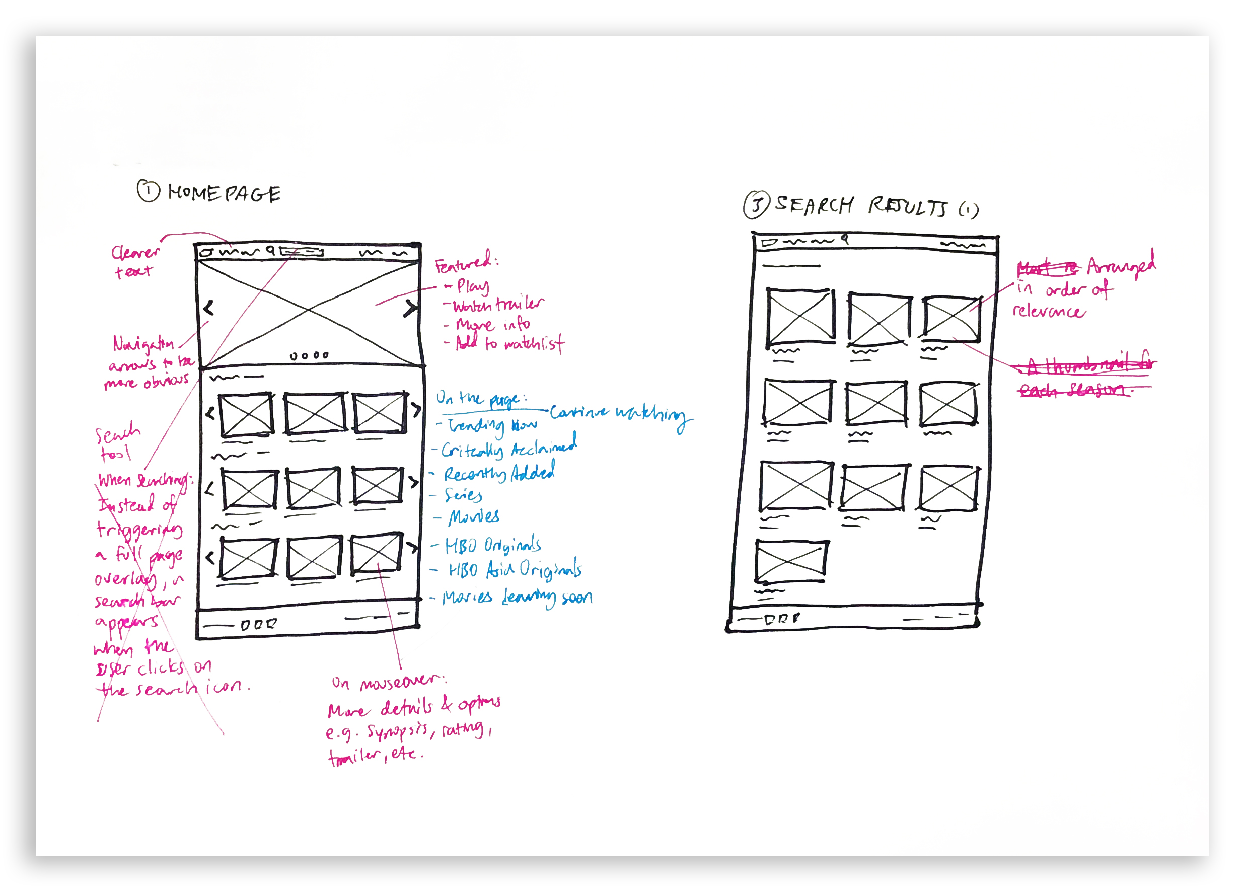
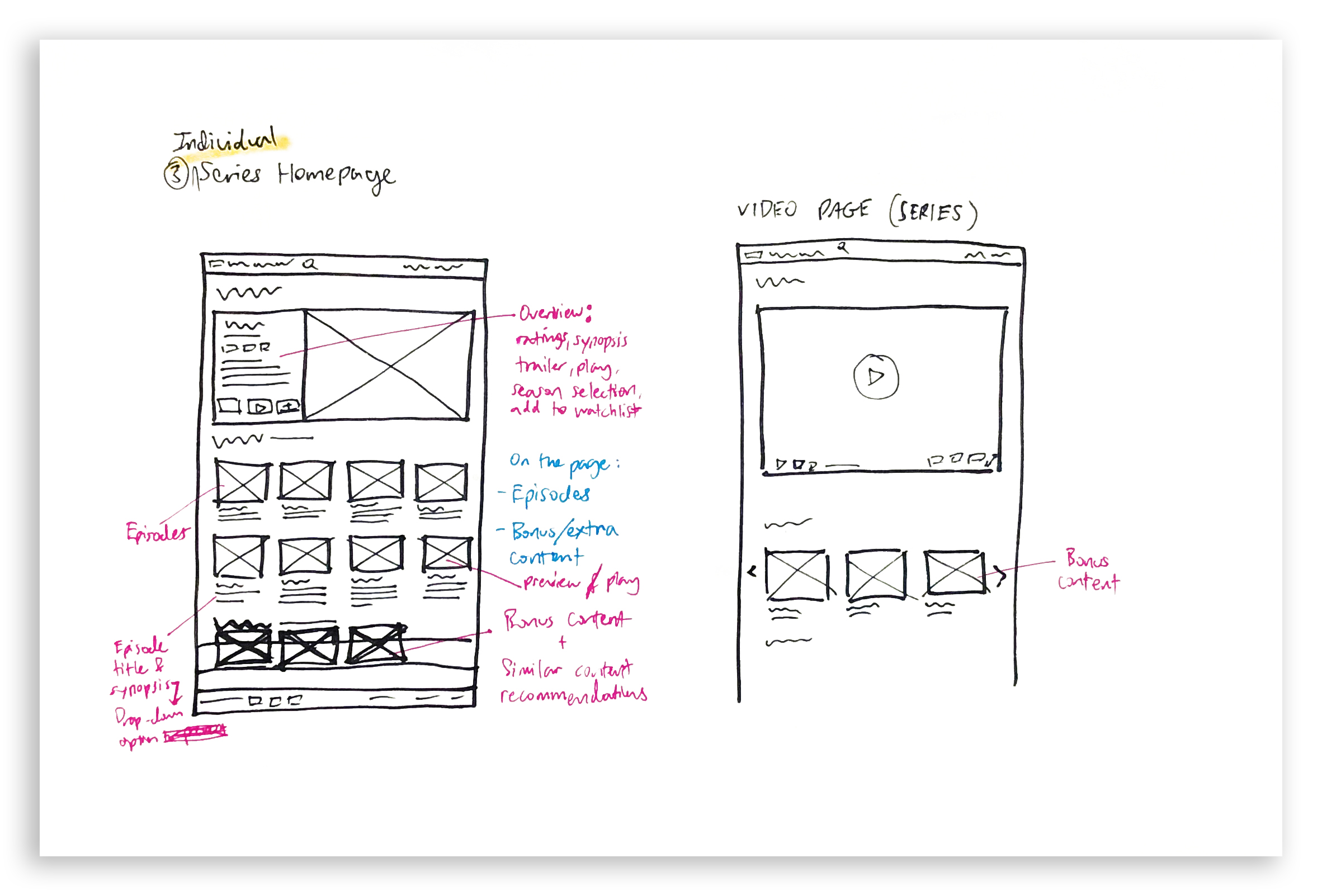
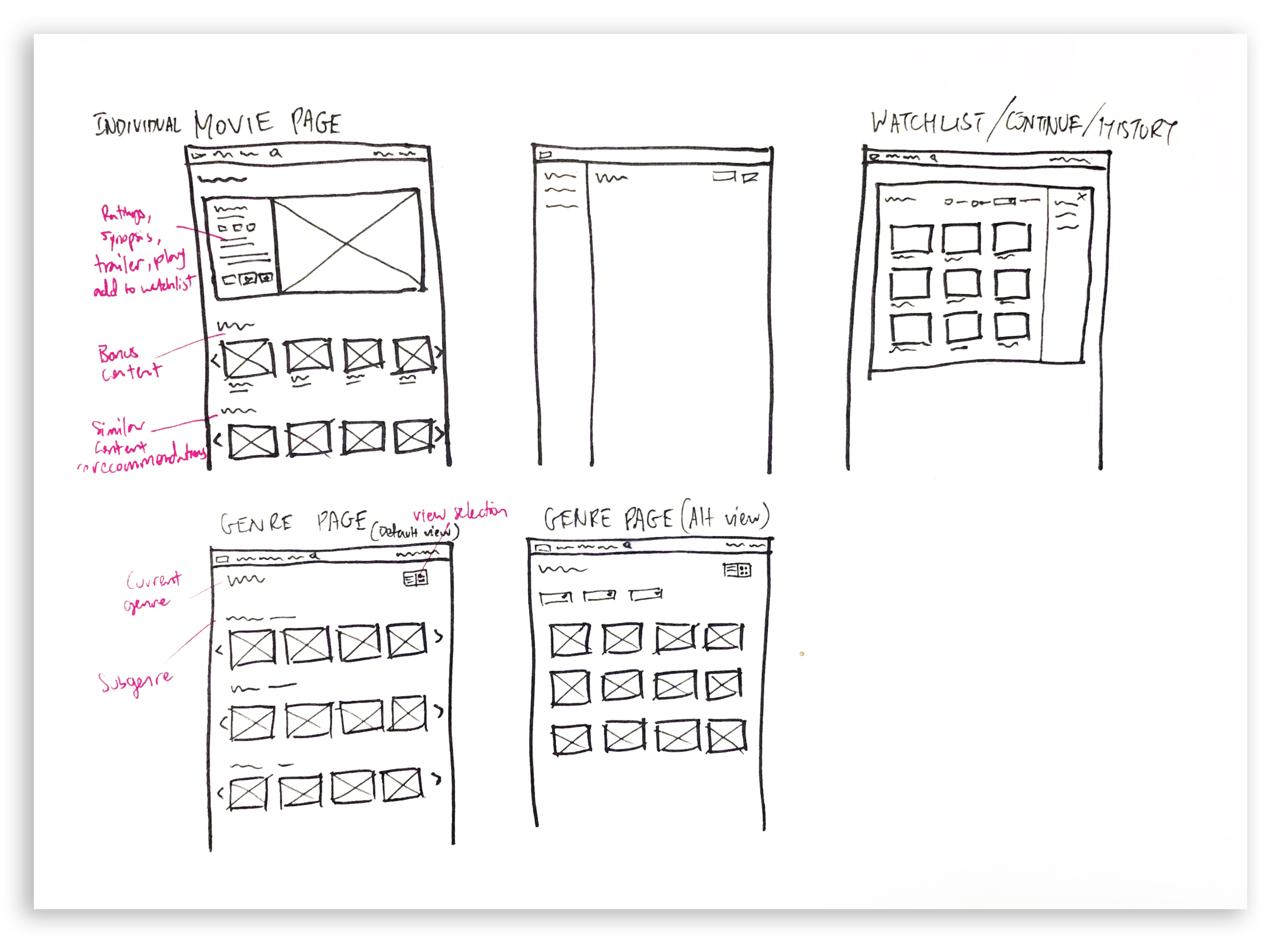
Using low-fidelity sketches, I started exploring ideas informed by the task flows. With these sketches, I was able to narrow down my ideas and solutions.

Mid-Fidelity
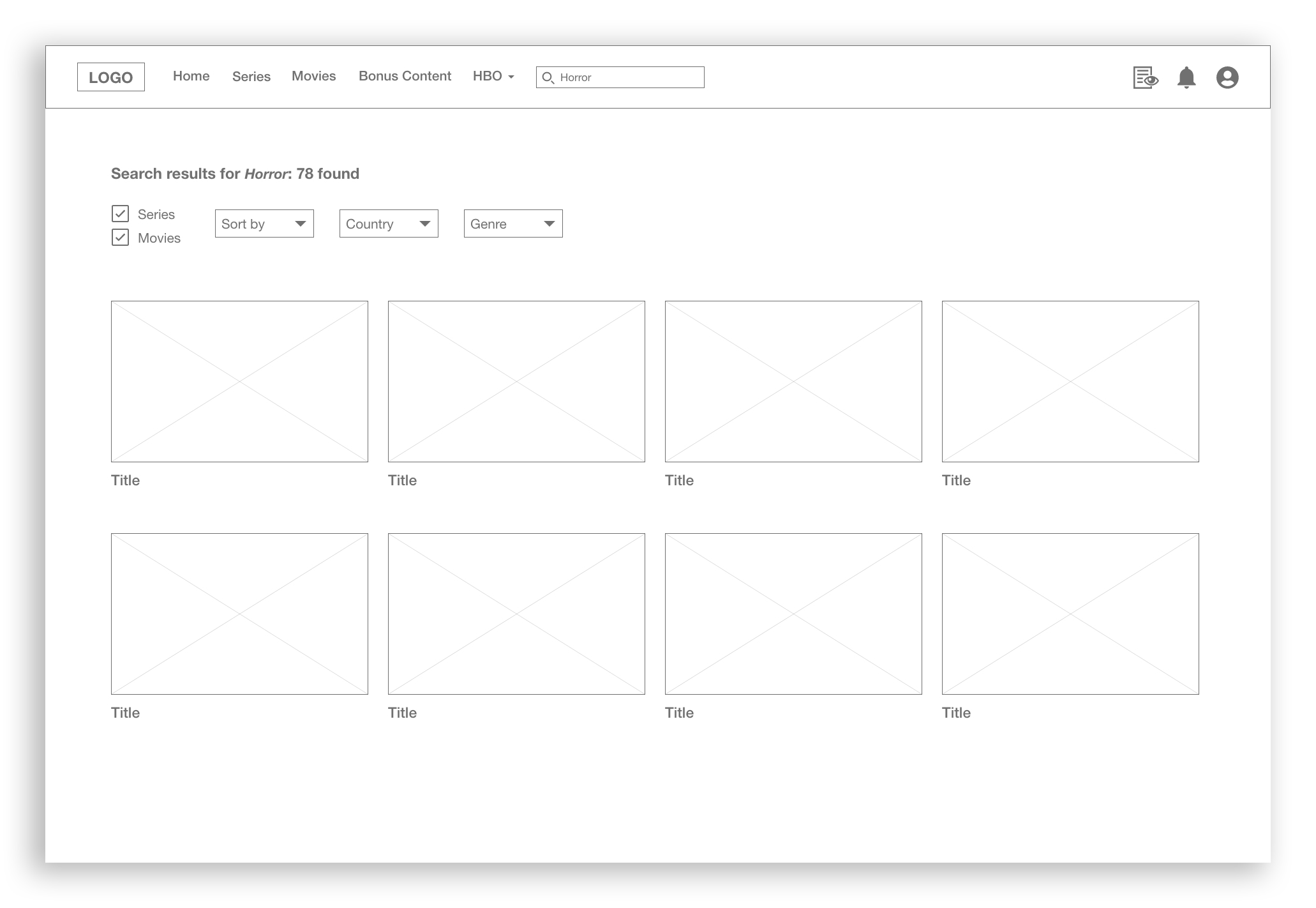
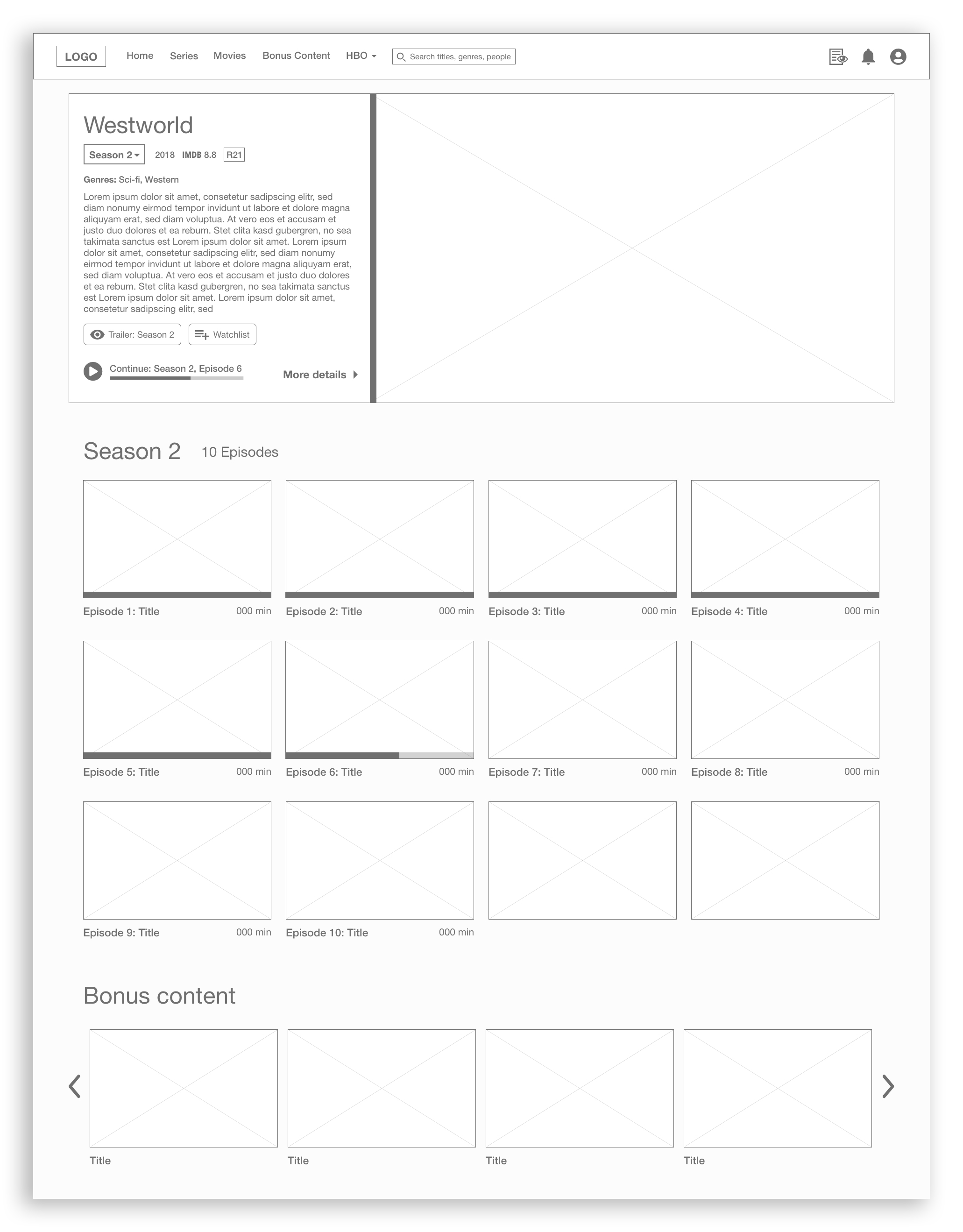
Using Adobe XD, I created a mid-fidelity prototype to better visualise the layout and navigation flows. I then tested them with 2 individuals and made a few small tweaks based on their feedback.


High-Fidelity
Once I was happy with the general layout and navigation flow between pages, I created a high-fidelity prototype using Adobe XD.
Task Flow 1
Search by title, look for information and trailer
Key Improvements:
Results prioritised based on content type and relevance
Bonus content (e.g. recaps and behind-the-scenes) are grouped on the search results page
Sort by and filter functions added to search results page
"Trailer" play button directly accessible upon thumbnail mouseover
IMDb ratings displayed on thumbnail mouseover and episode/movie page
Task Flow 2
Browse/search by genre
Key Improvements:
More genre filters added to Movies listing page
Separate page for each genre, where content is further categorised by subgenres. Users can select grid view to see all content under parent genre, with the option to filter by subgenre
Task Flow 3
Resume watching series
Key Improvements:
On mouseover, content thumbnails will display watch progress bar and allow users to directly click on "Continue" play button
Skip episode button on the video player
Right beneath the video player, users are able to view and select episodes from the current season
Usability Test
I conducted usability tests with 6 new users to get feedback and see how the changes in my prototype would perform.
Success Rate
Original success rate = 22.22%; Prototype success rate = 97.22%
Success rate increased by 75%
S = success (1 point), F = failure (0 points), P = partial success (0.5 points)
Ease of Use, Satisfaction, User Expectations
Overall Experience
Takeaways
Compared to the existing HBO Go site, the prototype has a significantly improved user flow and navigation, and users had a much easier time completing the tasks. There was also an increase in overall user satisfaction. As this was a personal redesign project, one aspect that I couldn't accomplish was improving the search system.
Observations made during the prototype test uncovered further areas for improvement, such as finetuning the interaction design to provide stronger signifiers and feedback when an action is taken. The next steps I would take would be to revise the prototype based on new data and user feedback collected, conduct another round of testing with a new set of users, evaluate the results, and repeat the process again if necessary.
While I initially approached the testing phase with theoretical knowledge of how the process should occur, testing with actual users in realistic scenarios was a valuable first-hand experience. It additionally taught me how I could better facilitate testing sessions in the future. Finally, this project provided me with more clarity on how I can improve the selection of benchmarking metrics and align them with project goals.


