Project Type
Personal
Date
Dec 2019–Jan 2020
My Role
Research, user testing & stories, wireframing, visual design, prototyping
Overview
Chope is a free restaurant reservation app that allows users to make instant reservations. Chope partners with restaurants/merchants to offer discounts and deals. It also has a membership programme where users can earn and redeem points for deals and discount vouchers.
Goal
Redesign Chope to be an app that is easy to explore and understand, and that users can confidently rely on to make decisions without feeling the need to turn to other sites.
Problem Statement
Chope’s main offerings—promotional deals, instant reservations, and their membership loyalty programme—are hindered by obstacles that increase the interaction cost and cognitive load of users.
This poses problems for new and existing users because not only does it lower user confidence in relying on the app to decide on restaurants and deals, it also prevents users from discovering and making the most of what the app has to offer.
If users are not convinced of the merits of choosing Chope, it could result in Chope losing users to competitors, which would directly impact Chope’s revenue.
Scopes & Constraints
This project focuses only the mobile app on the iOS platform
As this was a personal project, I worked on it independently and didn’t have an actual client to speak to. I had to imagine what the client needs and business goals would be based on online research.
Process
Desk Research
Chope Business Model
Two-fold business model for generating revenue
Charging its restaurant partners a monthly fee in exchange for software to manage their reservations, table inventory, queues and prepayment
Earning a commission when users purchase restaurant vouchers or make reservations
With this two-fold business model, Chope’s ability to attract and retain users and restaurant partners influence one another:
Market Research
In 2015 and 2018, Nielsen Holdings conducted an Out-of-Home Dining Survey to understand Singaporeans’ out-of-home dining behaviours and preferences.
How often do Singaporeans dine out?
According to the 2018 report, which polled 202 Singaporeans, there has been an increase in the frequency of Singaporeans eating out. Close to 1 in 4 respondents indicated that they eat out daily, while more than half do so on a weekly basis.
User Research
Target Demographic
Existing Chope users
Potential Chope users: people who already make restaurant reservations but have not done so with Chope
Tertiary students: limited budget, but still dine out regularly and are willing to spend a bit more on a dining experience when celebrating occasions
Adults between the age of 25-45: they have spending power and are generally more tech-literate than older age groups and as such would be more inclined to use apps
Professionals who conduct business meetings regularly over meals or drinks
Usability Test
I conducted a usability test with 6 users in order to identify the pain points of using the Chope app. Users were asked to perform 4 tasks on the existing Chope app and were encouraged to think aloud. They were then asked to complete a survey measuring user satisfaction rating, ease-of-use, and perceived usability.
Click to enlarge images
Success Rate
Success rate = 43.75%
S = success (1 point), F = failure (0 points), P = partial success (0.5 points)
Ease of Use, Satisfaction, User Expectations
Overall Experiences
Usability Test Takeaways
Reduce interaction cost and cognitive load: 1) minimise the steps to accomplish a task, 2) avoid lengthy text and as much as possible accompany visuals/graphics with short clear captions
Provide good relevant images to increase restaurant credibility and influence user decisions
To increase user confidence, anticipate and answer questions about listings by providing sufficient information
Provide a reliable search system that allows advanced filtering by cuisine preference, dietary restrictions, budget, location limitations, and occasion needs
Reduce paradox of choice so users do not feel too overwhelmed to explore
User Persona
To help guide my design decisions and priorities, I created Dora, a persona based on my user research.
Click to enlarge image
Job Stories
I used Job Stories to explore user motivations and desired outcomes in different contexts. I created the following job stories based on real-life restaurant booking experiences recounted by users.
Click to enlarge image
Affinity Mapping
Using affinity mapping, I organised the data collected from the test into similar groups. I then prioritised the pain points and insights based on my observations and conversations with users during the test.
Click to enlarge image
Task Flows
I created task flows to show the flow for users carrying out the tasks in the usability test. Using the usability test findings and persona, I then created improved task flows to base my redesign on.
Click to enlarge images
Task Flow 1
Look for a well-rated place for a group with dietary restriction
Task Flow 2
Look for deals nearby
Task Flow 3
Learn about Chope membership reward system
Sketches
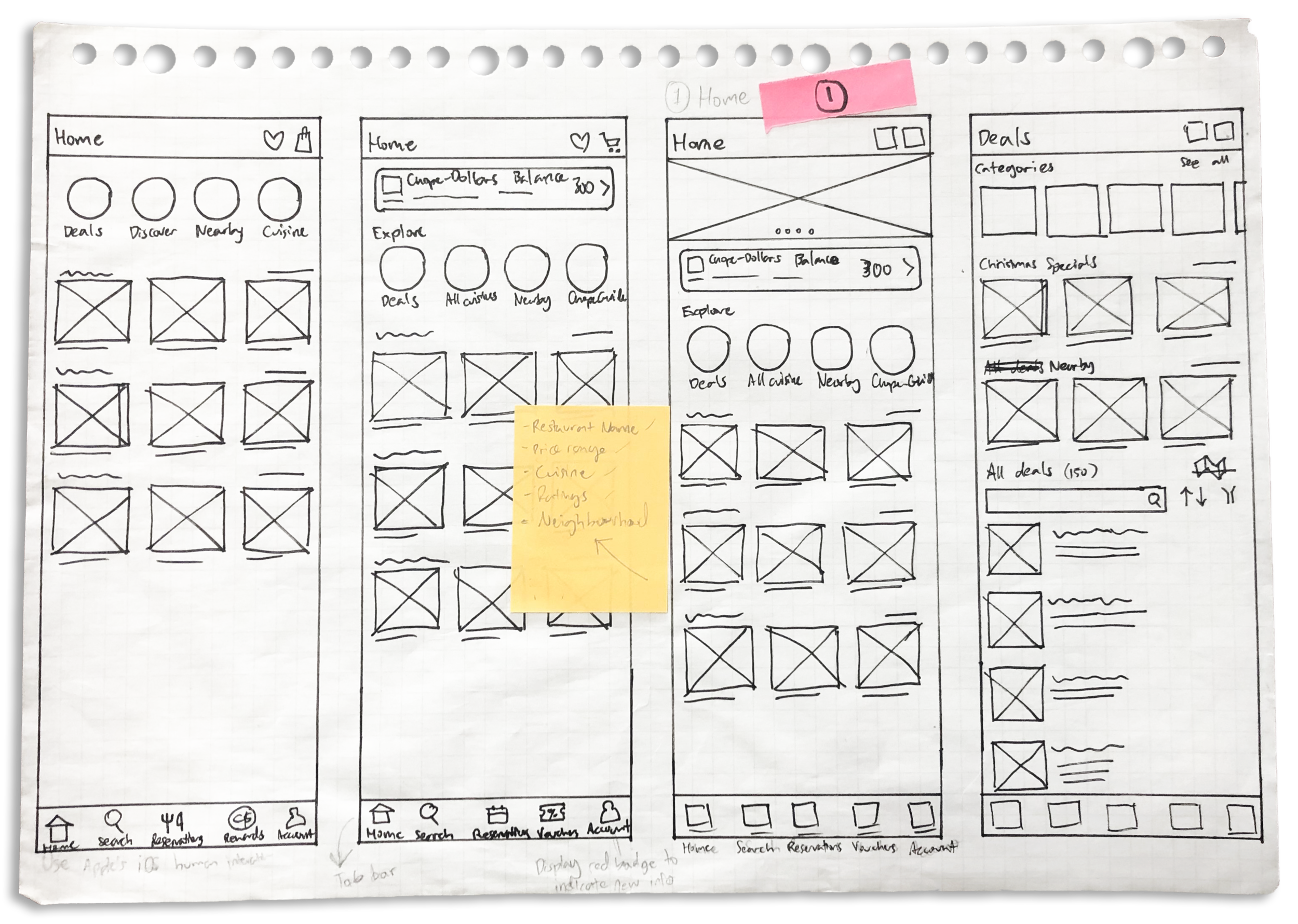
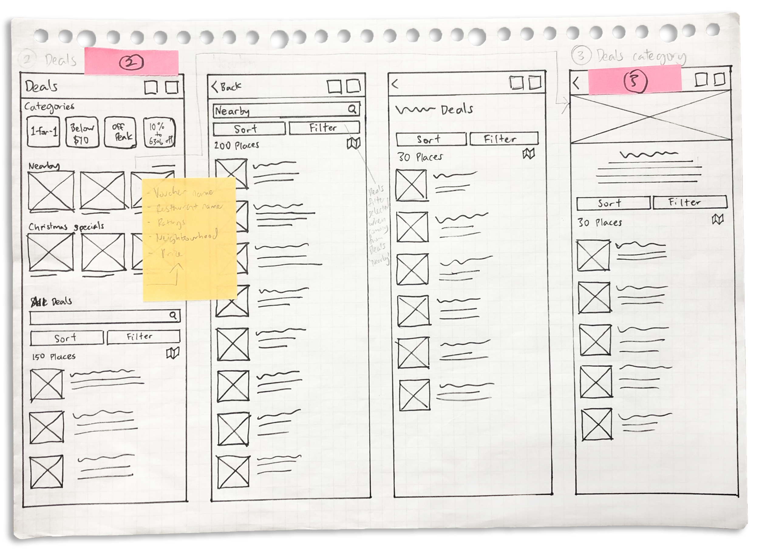
Using the task flows, I started ideating solutions with sketches.
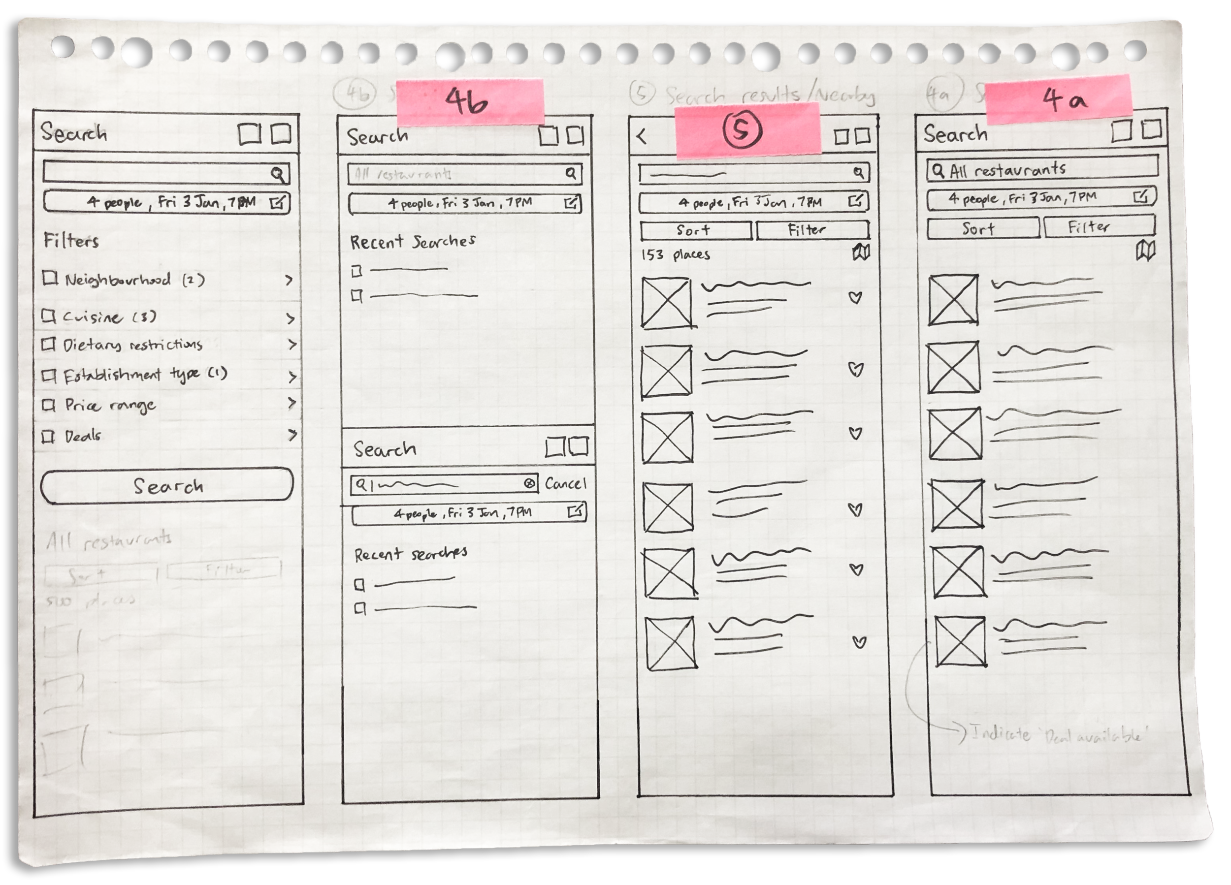
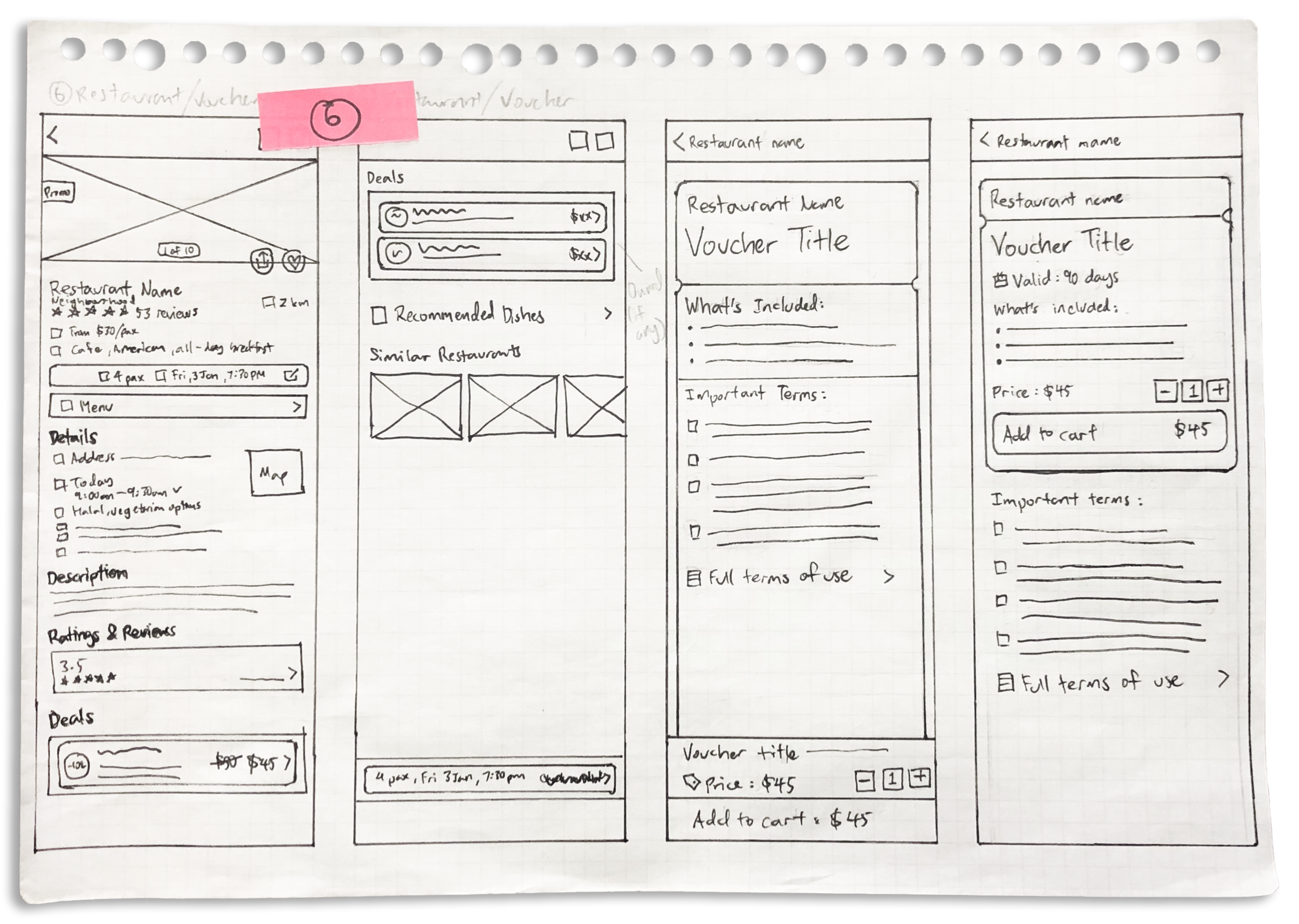
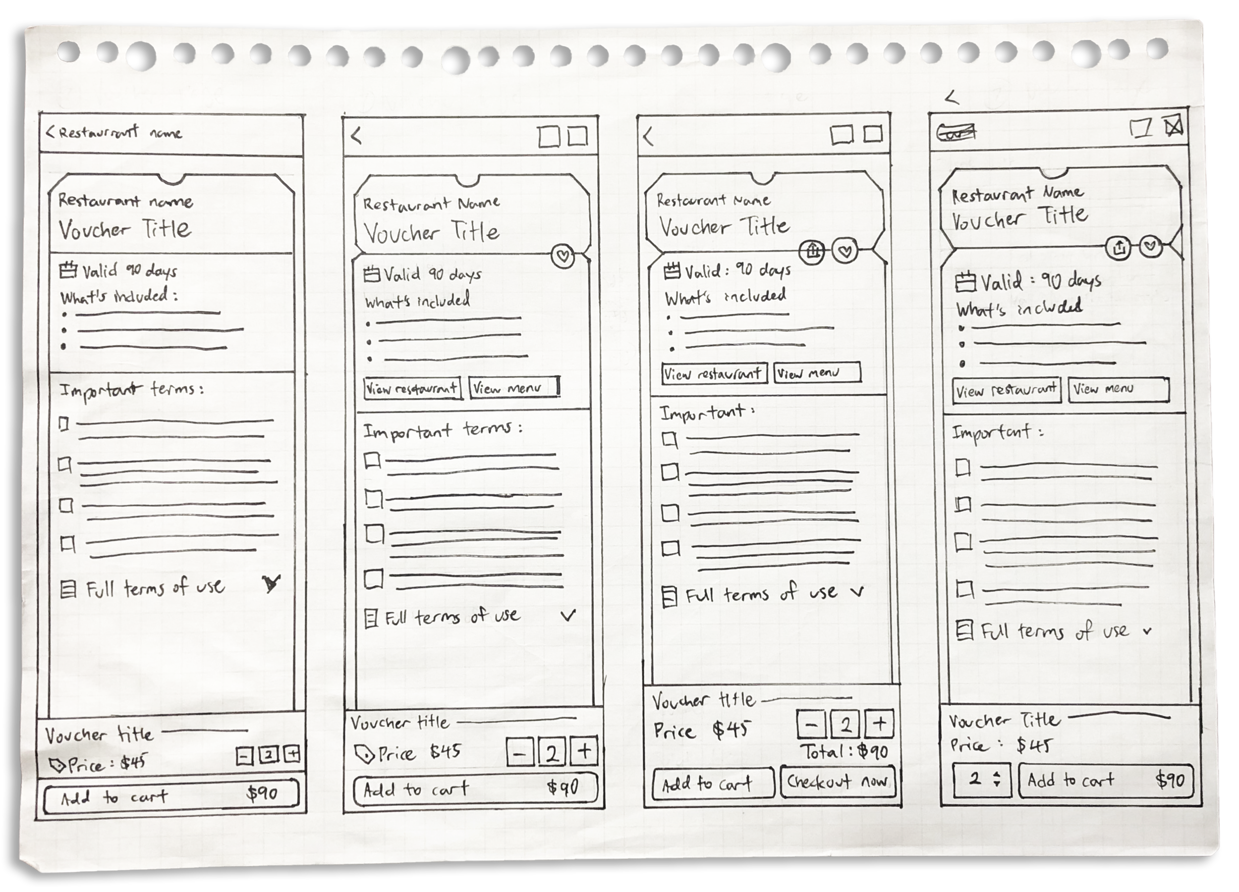
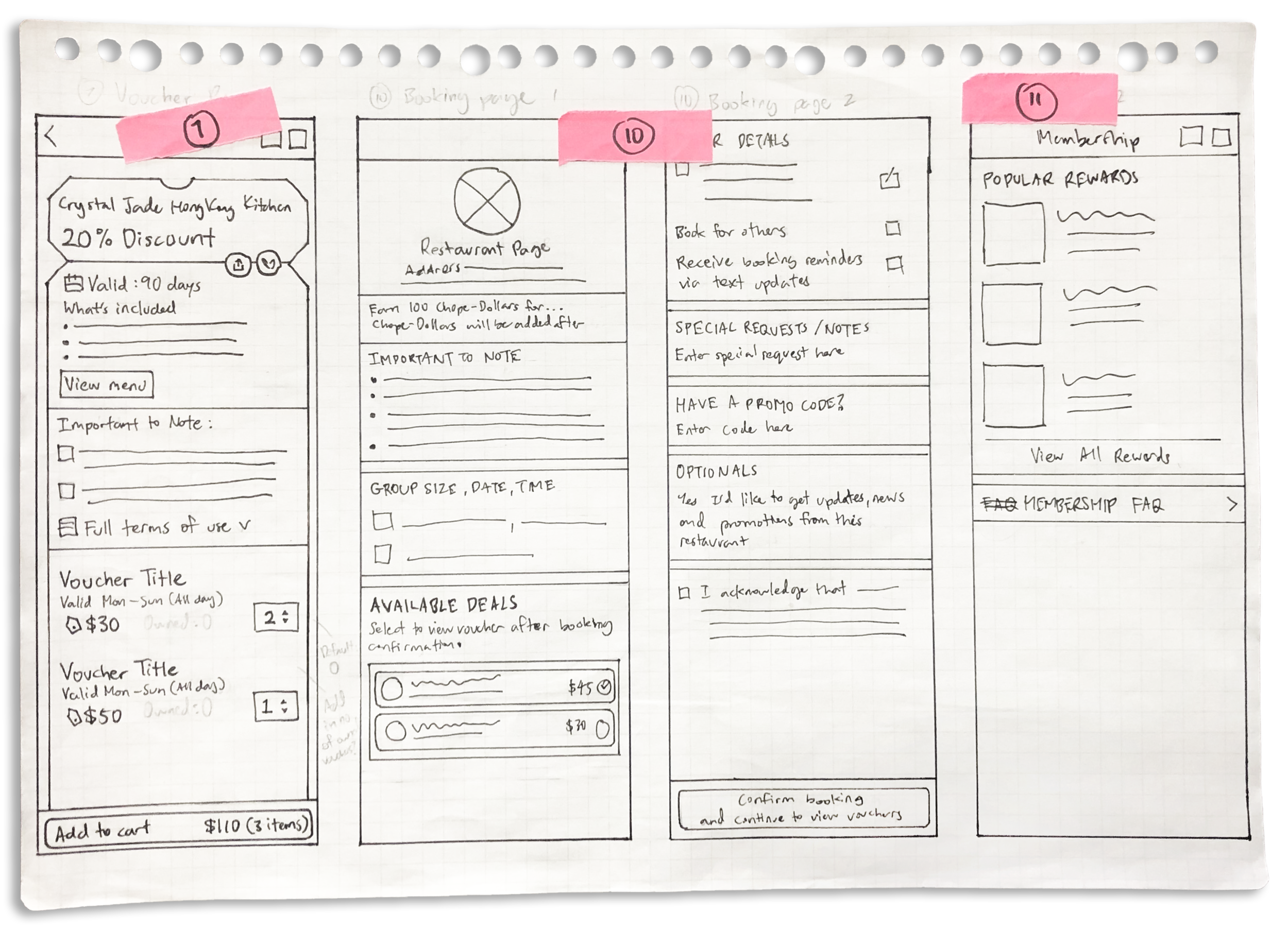
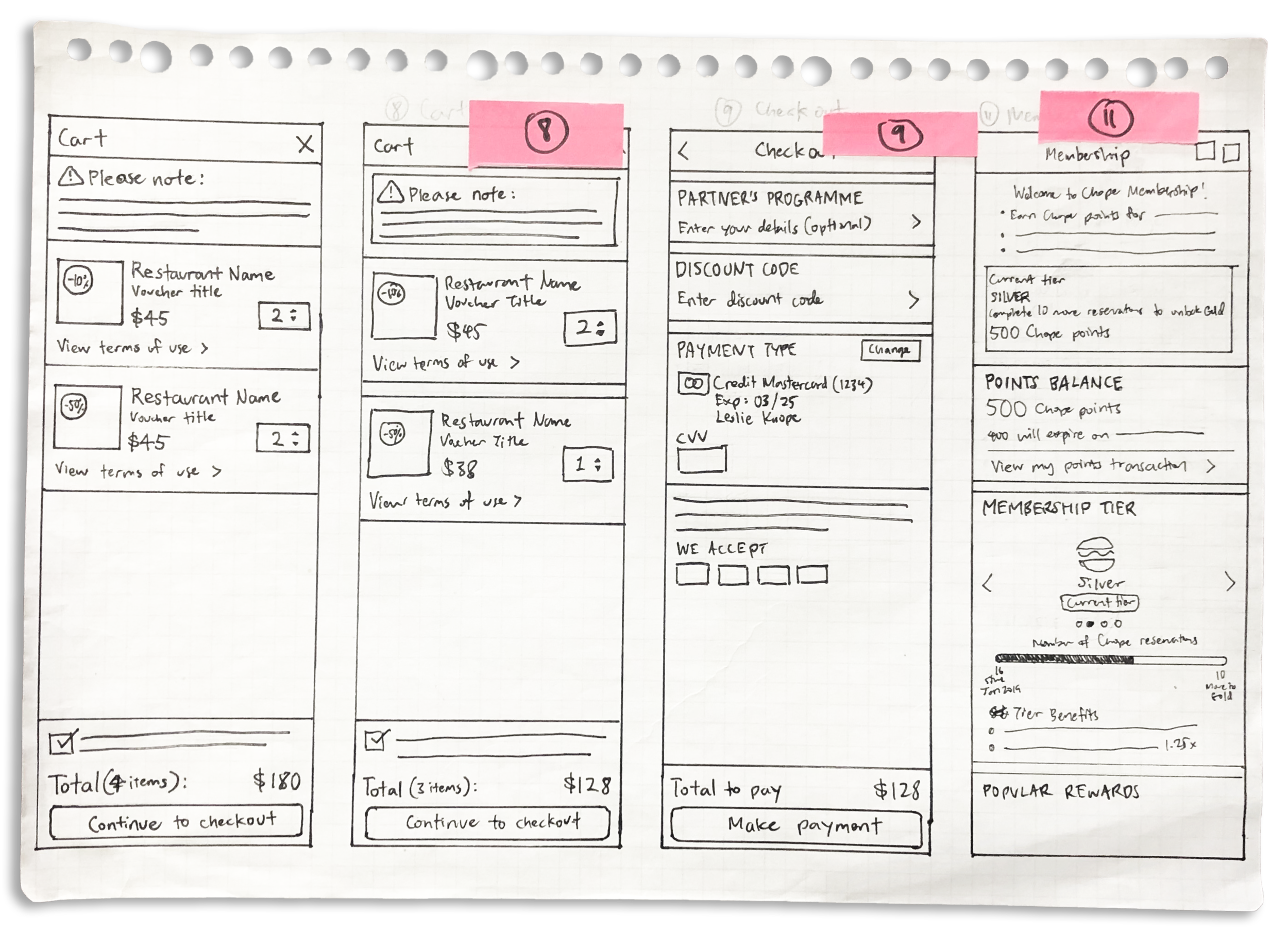
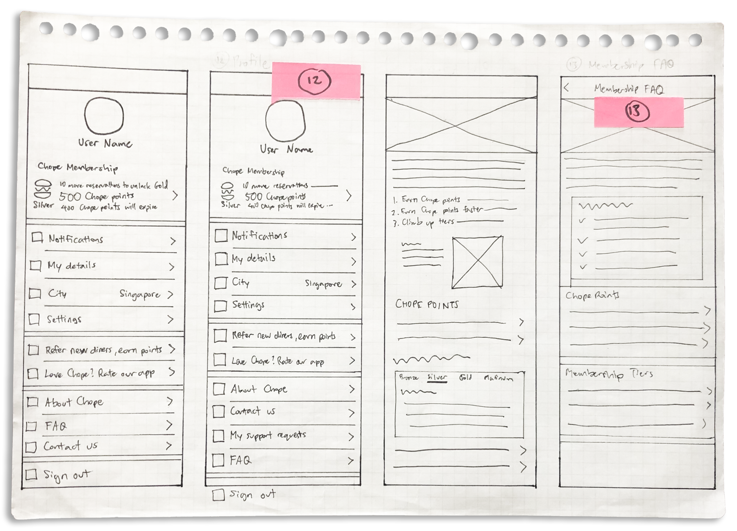
Mid-Fidelity
Using Adobe XD, I created a mid-fidelity prototype to adjust the layouts and test navigation flows. I then tested them with 2 individuals and made changes based on their feedback.
High-Fidelity
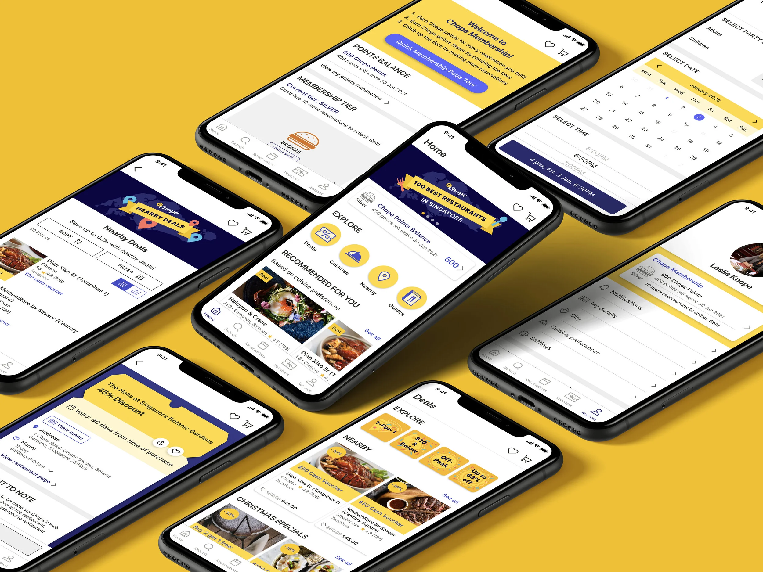
After finalising the layouts and solutions, I used Adobe XD to create a high-fidelity prototype.
Task Flow 1
Look for a well-rated place for a group with dietary restriction
Click to play video
Key Improvements:
Search and Browsing
New homepage categories based on what users find the most helpful
1 standardised search page with filter options
Created new “Dietary Restriction” and “Restaurant feature” filter categories
Price range filters now specify the approximate amount for each tier
Restaurant information and menu
Include at least a few images of the restaurant in each listing
Added: dietary restrictions, user ratings/reviews, restaurant contact number and website
Standardised menu for all restaurants
Making a reservation
If users specify party size, date, and time during the search process, their previously inputted data will be saved for review on the reservation booking page
Task Flow 2
Look for deals nearby
Click to play video
Key Improvements:
Added a “Nearby” deals category
Users can filter by location
Basic restaurant information (address, hours, menu) added to the voucher page
Task Flow 3
Learn about Chope membership reward system
Click to play video
Key Improvements:
Improved Profile page (renamed “Account”) with new customer support features such as “Contact us” and “My support requests”, which allows users to keep track of submitted enquiries
Cleaned up the FAQ page so it’s shorter and less messy
Created a “Membership page tour” on the Membership page that uses progressive disclosure to guide users through the information presented on the page
Usability Test
After creating the prototypes, I conducted usability tests with 6 users to see how my changes would perform.
The tasks were similar to the ones given in the round of testing with the original Chope app, except that there were 3 instead of 4 tasks because I combined two of them.
Success Rate
Note:
S = success (1 point), F = failure (0 points), P = partial success (0.5 points)
Original success rate: 43.74%, Prototype success rate: 91.66%
Ease of Use, Satisfaction, User Expectations
Overall Experience
Takeaways
What I have learned
This project has shown me that users have very limited patience; they want to be able to get answers to their questions quickly, and have low tolerance if expected features are missing. When it comes to performing tasks such as making reservations, users expect an easy and reliable process in which they can quickly accomplish their goal and be confident that they were successful in doing so. With features like deals (discount vouchers), which involve on-the-spot purchases, it is crucial for terms and prices to be presented as succinctly as possible, so that users don’t have spend too much time reading, but neither do they have to do any guesswork or worry about post-purchase regrets caused by ambiguous information. Lastly, given the limited space of a mobile app, it is more important than ever to eliminate clutter because the more time a user wastes separating useful information from everything else, the less satisfied they become and the less likely they would want to use the app again.
The next steps
With the new data and user feedback collected from my prototype test, I would revise the prototype, conduct another round of testing with a new set of users, evaluate the results, and repeat the process again if necessary.


